Also see Root Cause Analysis @ http://qualityg.blogspot.com/2006/07/quality-tooltechnique-root-cause.html
Below is a Quality Tools/Technique step-by-step example on how to construct a Pareto Chart with analysis and a workshop to help learn the tool better.
The Pareto Principle is very simple, yet very important. It is named after Italian economist Vilfredo Pareto, who, in 1906, found that 80% of the land in Italy was owned by 20% of the population.
What was most important about Pareto’s finding was that this 80/20 distribution occurs extremely frequently. For example, in general, 20% of your customers represent 80% of your sales.
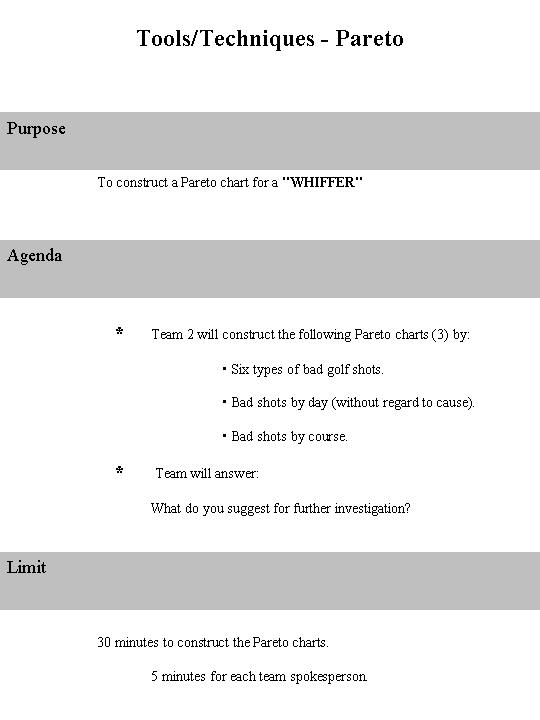
Following that is a Pareto Workshop with PAL (Purpose, Agenda, Limit).
Pareto Chart Analysis is a visual tool that is used to identify the "critical few" problems that most impact our process. It is the search for significance. Most problems are due to only a few probable critical causes. This chart allows us to see which categories contribute most to the problem. We will gain more from our efforts by focusing on the most critically occurring problems.
Constructing a Pareto Chart (click on graphs & data to enlarge pic)
To construct a Pareto Chart, organize the data collected (usually from a checksheet) into categories. Categories consist of distinctly different groups of data. An observation placed in one category excludes it from belonging to another category.

Step 1: Total the raw data of each cause category and then determine the grand total
effect by adding together the effects of all the cause categories.
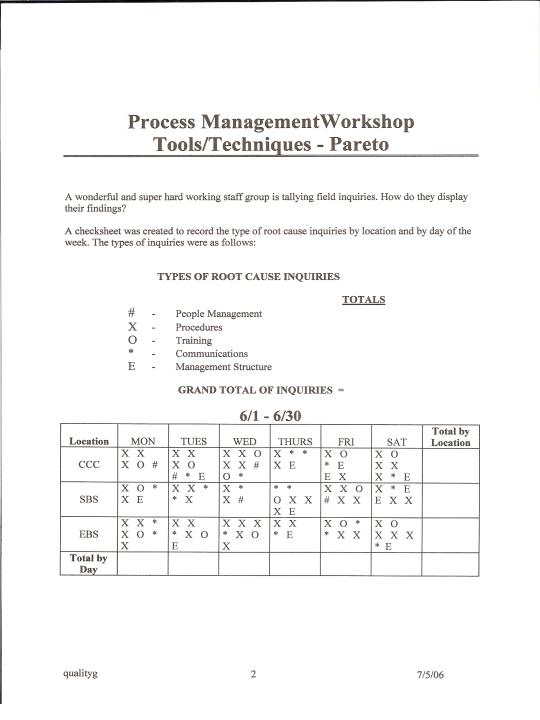
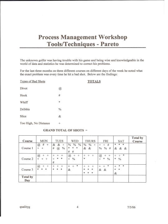
A Telecom Process Improvement Team developed a checksheet and asked the customer service reps to record the cause for each customer call about billing problems during a one-week study period. At the end of the week, the team collected the checksheets and tallied the results by specific cause.
Step 2: Re-order the probable causes from the largest to the smallest.
Step 2: Re-order the probable causes from the largest to the smallest.
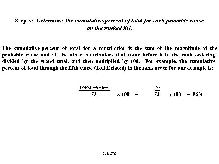
 Step 3: Determine the cumulative-percent of total for each probable cause on the ranked list.
 The cumulative-percent of total for a contributor is the sum of the magnitude of the probable cause and all the other contributors that come before it in the rank ordering, divided by the grand total, and then multiplied by 100. For example, the cumulative-percent of total through the fifth cause (Toll Related) in the rank order for our example is:
 The resulting table is called a Pareto Table or Cumulative Frequency Table.
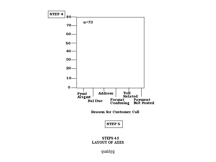
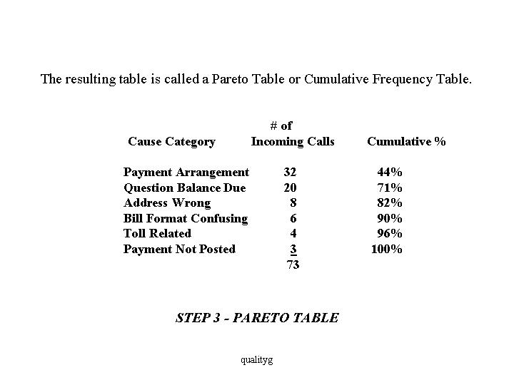 Step 4: Draw and label the left vertical axis.
 The units on the axis should range from 0 to a convenient point equal to or slightly greater than the grand total. In this case, the grand total is 73, so we construct an axis from 0 to 80. Always provide a heading on the axis to describe the measure being used.
Step 5: Draw and label the horizontal axis.
Divide the horizontal axis into the same number of equal divisions as there are probable causes.
List the contributors, in rank order, going from left to right. Provide a heading to describe them.
If you have trouble fitting the contributor names on the horizontal axis, label the axis with the letters A, B, C, etc., and provide a key somewhere on the Pareto diagram to list the probable causes names.
Step 6: Draw and label the right vertical axis. The units on the axis should range from 0 to 100%. Line up the 100% point with the grand total on the left vertical axis. At a minimum, show the 50% point on the axis.
The 50% point on the right axis should line up with a value on the left axis determined by the following formula:
Value on X / Grand
Left Axis = 100 x Total
In our example, the grand total is 73, so the 50% point on the right axis should line up with 36.5 on the left axis.
50 /
100 x 73 = 36.5
Provide the heading: "Cumulative-Percent of Total."
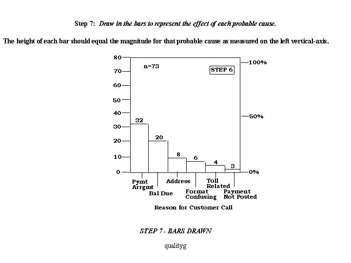
Step 7: Draw in the bars to represent the effect of each contribution. The height of each bar should equal the magnitude for that contributor as measured on the left vertical-axis.
 Step 8: Draw a line graph to represent the cumulative-percent of total. Plot a point directly above the right-hand edge of each bar at a height equal to the cumulative-percent of total for that category as measured on the right vertical-axis. If you have labeled the axes correctly, the cumulative-percent of total point for the first ranked contributor should be even with the height of the first bar. If not, you have made an error.
Step 9: Analyze the diagram. Look for the break point on the cumulative-percent of total graph; this represents the boundary between the "vital few" and the "useful many." In our example, this break point occurs between the second and third contributors.
 Step 10: Interpretation. In most cases, 80% of the problems result from 20% of the causes. This is called the 80/20 rule. This is the basis for a Pareto analysis. The percents do not have to be 80% and 20% exactly. We are looking for significance. If our chart shows an 80/20 pattern, we should brainstorm why these critical bars are contributing to the problem. We may need to collect more information, or a secondary Pareto Chart can be completed to further stratify the category.
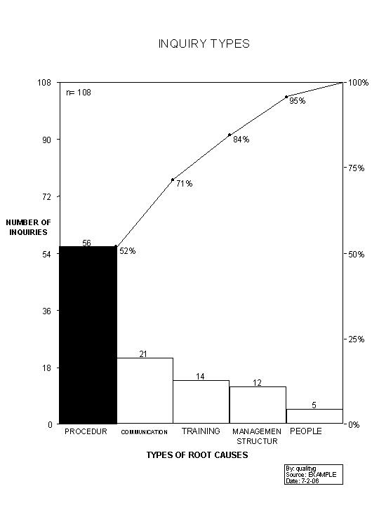
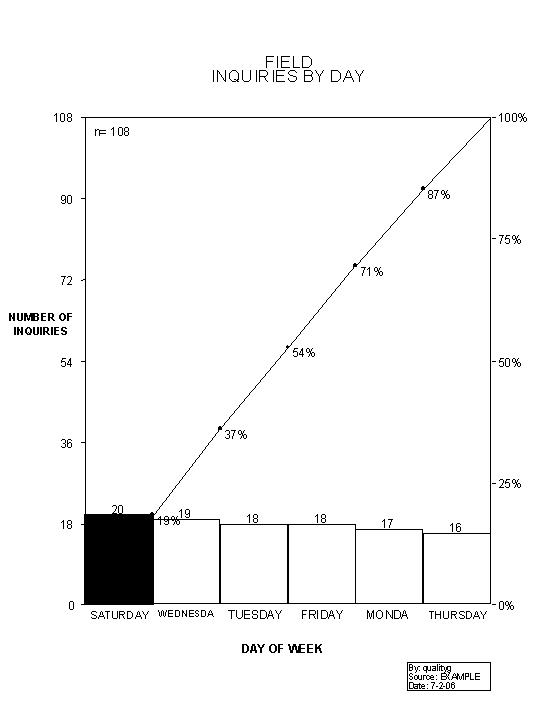
Below is an example of an actual stratified Payment Arrangement Pareto Chart that was done by the Service Integration Department for use in their Incoming Billing Call Mix Study.
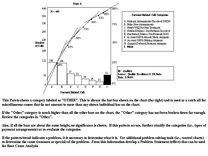 This Pareto shows a category labeled as "OTHER". This is always the last bar shown on the chart (far right) and is used as a catch all for miscellaneous causes that do not amount to more than any shown individual bar on the chart.
If the "OTHER" category is much higher than all the other bars on the chart, the "Other" category has not been broken down far enough. Review the categories in "Other".
Also, if all the bars are about the same height, no significance is shown. If this pattern occurs, further stratify the categories (i.e., types of payment arrangements) or re-evaluate the categories.
Don't forget that Pareto Charts and analysis can be very useful when categorized with dollar amounts per problem. For example 4 problems may result in a thousand dollars, where as 100 problems may only result in $100.00 dollars.
Pareto Charts (attribute data) and Histograms should only be made after you have completed the initial trend analysis and are trying to determine what to do to improve the process. Although the Histogram and Pareto Charts are useful for analyzing process data, the time sequence that the process data occurred in is lost in this analysis. The control chart maintains the time sequence of the data.
If the pattern/trend (determined from control charts) indicates a problem (i.e., probable cause), it is necessary to determine what it is. Use additional problem solving tools (i.e., analysis techniques, SIPOC, Histogram, , etc...) to determine the type of cause (common or special) of the problem. From this information develop a Problem Statement (effect) that can be used for Root Cause Analysis.
SIPOC EXAMPLES CAN BE FOUND @ http://qualityg.blogspot.com/2006/10/quality-tooltechnique-sipoc-cccc.html
AND
http://qualityg.blogspot.com/2006/10/qualitygs-sipoc-analysis-questions.html
FOR INFORMATION ABOUT DATA COLLECTION + EXAMPLE FORMS GO TO (click):
Data Collection + Forms
Pareto Workshop with PAL (Purpose Agenda Limit)
Click on PIC Once to ENLARGE - Then click again on 4 arrows to ENLARGE again


I hope you can utilize my post on Pareto Charts. Let me know if you add anything to make the process better. qg
7 comments:
QG,
Great Example!
Process Pam
This one of the best examples of Pareto Charts and analysis I have come across on the Internet.
Best of all it's free!
Jerry
The examples you provided really helped me understand this tool much better.
I like how you use both a business example and a game example.
Regards
Your instructions and examples have helped me to finally understand this tool.
Thanks,
Jason
Thanks for posting a useful tool tutorial with example with interpretation
Excellent information provided by this blog.
A Pareto chart is a bar chart. The lengths of the bars represent frequency or cost (time or money) and are ordered with the longest bars on the left and the shortest bars on the right. In this way, the graph visually shows which situations are most significant. This cause analysis tool is considered one of the seven basic quality tools.
https://ppcexpo.com/blog/how-to-read-pareto-chart
Post a Comment